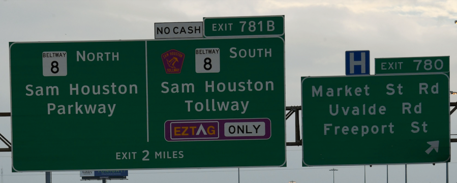
Only those with an acute attention to detail have noticed something wonky has been happening to signs on U.S. freeways and interstates over the past several years.
Federal highway authorities haven’t been able to decide what font makes for the clearest, safest road signage, leaving some states with signs written in a font called Highway Gothic, others with signs in Clearview, and some places with a mixture of both.
This font saga dates back to 1948, when the Federal Highway Administration adopted Highway Gothic, a modified Gothic font, as its standard. The federal authority made the change following studies by the California Department of Transportation, which was seeking an easy-to-read font that wouldn’t be distracting to drivers.
But that easy-to-read font wasn’t so easy to read come the 1980s, Vox reports, when reflective highway signs became ubiquitous. The reflective signs were supposed to be easier to see at night, but as they reflected more light back to drivers, people – especially the elderly – had trouble reading them due to halation.
Halation is an optical effect that can make the edges of lighted objects appear blurry, like there’s a halo effect. It’s sometimes experienced during night driving, and it was making lowercase letters, like e, appear like an o on road signs.
So type design firm Meek & Associates worked with researchers at the Larson Pennsylvania Transportation Institute to come up with a solution. What they created was called Clearview, a font they said improved legibility by about 20% for all drivers with no change in the sign’s size.
Clearview was given the green light by the Federal Highway Association in 2004 and it became an option for road signage in the U.S. – at least for a period of time. (More on that later.)
While the two fonts don’t look dramatically different, you can spot the changes if you take a close look at letters like l, t and d. You’ll see a slant at the top of those letters. The interior space of the letters like a, o and e is pretty small.


With Clearview, the interior space of lowercase letters was made larger to help with halation. The tops of skinny letters like l, t and d were also flattened.
You can see an example of both fonts side-by-side on a Texas roadway (below): Clearview is on the left and the older Highway Gothic is on the right. Look at the lowercase letters for the most obvious differences.

When the change was made in 2004, some states immediately started redoing their signage to be in Clearview.
But then, a study out of Texas claimed that Clearview wasn’t actually any easier to read than Highway Gothic. The Federal Highway Administration rescinded its approval of Clearview in 2016.
Designer Don Meeker, who worked on creating Clearview, contested the Texas researchers’ findings, telling CityLab, “They don’t understand design.”
“Helen Keller can tell you from the grave that Clearview looks better,” he said.
The saga doesn’t even end there. Federal authorities changed their minds again in 2018, regranting states permission to use Clearview over Highway Gothic, if they so choose. In this case, the agency chose not to endorse one over the other.
That brings us to where we are today, with an eclectic mashup of highway signage depending on the state and the date it was installed.
An urban design video creator, who posts under the account Streetcraft, noticed the transition from Highway Gothic as he drove north on I-75, starting if Florida, Georgia and Tennessee, where Highway Gothic is still used, into Kentucky where everything switches to Clearview. Further north, in Ohio, you’ll see both (depending on when the sign was installed), before heading back into Clearview territory in Michigan.
Curious which font your state uses? Consider it a low-tech road trip game next time you’re on a long drive, and check those lowercase letters closely.


